Purffle / Purffle Chartwright / Guides
Support, resistance and ATR stops, explained simply.
Four readings do most of the work on any chart: where the levels are, how much the instrument normally moves, whether the trade pays for its risk, and whether there is a trend at all. Here is what each one means, with real numbers.
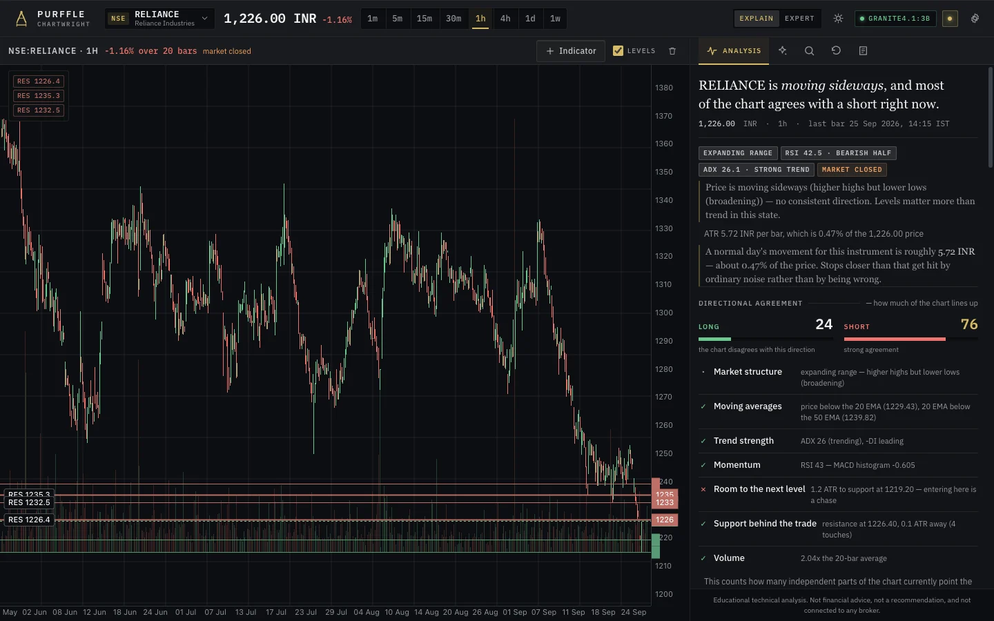
Support and resistance: where price turned before
A support level is not a line you draw where it looks nice. It is a price where the market has already turned — a swing low, where price fell, stopped and rose again. Resistance is the same idea from above: a swing high.
Not all levels are equal. Three things separate a real one from noise:
- Touch count — how many times price came back to it and reacted.
- Recency — a level respected last week says more than one from two years ago.
- Cleanliness — did price turn crisply, or slice through and come back?
Put together, a well-described level reads like this: "Support at 1,359.95 — the swing low of 12 Aug, retested four times since, held each time." Every part of that sentence can be checked on the chart.
ATR: how far the instrument normally moves
Average True Range measures a normal bar's movement. Each bar's true range is the largest of: high minus low, the gap from the previous close up to the high, or the gap from the previous close down to the low. ATR(14) averages that over the last 14 bars.
Why it matters: a stop closer than about one ATR gets hit by ordinary noise rather than by the trade being wrong. So measure stop distance in ATRs, not rupees or dollars. In the example above, ATR(14) is 7.03, and a stop at the 1,359.95 support sits 2.50 ATR below price — outside the everyday wobble.
"ATR 21.48 INR · 1.64%" means a normal day's movement for that instrument is roughly ₹21.48. Stops closer than that get hit by ordinary noise rather than by being wrong.
Reward to risk: does the trade pay for itself?
Divide what you stand to make at the first target by what you lose if the stop is hit. Suppose you would be risking ₹32.20 a share to make ₹16.50 at the first target:
16.50 ÷ 32.20 = 0.51 → 0.51 : 1That is below a 1.5 : 1 minimum, so the honest answer is that there is no trade here — however good the chart looks. A level with no room to the next one fails this test more often than people expect.
ADX: is there a trend at all?
ADX measures how convinced the market is, not which way it is going. A reading of 13.9, for example, means little conviction — price is drifting rather than trending, and trend-following signals deserve less weight.
Fibonacci, with the evidence
Retracement ratios are drawn on almost every chart online. The useful question is how many times price actually reacted at each ratio on this instrument. Often the answer is zero — and then the line is decoration.
Let the engine do the arithmetic
Purffle Chartwright computes all of this — swing structure, levels ranked by touch count and recency, ATR, ADX, reward to risk and position size — in about 0.2 seconds, with no language model involved. Turn on Explain and each reading gets one plain-English sentence underneath, like the ones in this guide; switch to Expert and they disappear. The numbers are identical either way.